CPQCC’s NICU Reports site allows you to visualize and understand your NICU data and use those insights to drive improvements in NICU care. Below we profile a few of our most exciting types of reports. For more information on available reports >
To gain access to your NICU's reports:
Interested parties can also log in to the NICU Reports demo site to gain a better understanding of what is available using the following credentials:
User ID: demo0000 / Password: Madeline2!
Health Equity Dashboard
CPQCC’s Health Equity Dashboard displays critical process and outcome measures by race and ethnicity to allow NICUs to see if and where disparities in care exist. In 2020, CPQCC elevated the Health Equity Dashboard to be the first report members see when they login to the NICU Reports site. The video below provides a brief overview of the Health Equity Dashboard and how it can be used to improve care in your NICU.
Baby MONITOR
The Baby MONITOR report allows NICUs to look at a composite score of overall quality of care at their NICU and benchmark their performance against the entire CPQCC network. Baby MONITOR combines measures of positive performance on antenatal steroids, timely ROP exams, absence of nosocomial infection, temperature on admission, absence of pneumothorax, growth velocity, oxygen at 36 weeks, human milk nutrition, and survival to give teams a holistic picture of the quality of care they are providing.
NICU Dashboard
The NICU Dashboard serves as a launchpad for quality improvement, providing a snapshot of both clinical and operational metrics for each NICU. The dashboard can be used to get a sense of areas where a unit is performing well and areas that may require further attention. Graphs can be downloaded in JPEG or PDF formats for distribution among the NICU team or to hospital leadership.
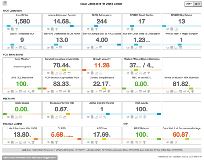
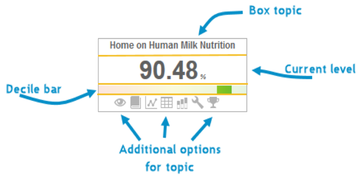
For each topic, a quantitative measure of the NICU’s current level of performance is shown. QI measures are reflected in green for NICUs performing among the top 10% in the state, and in orange for those in the bottom 10%. The decile bar provides a snapshot of the NICU’s performance relative to all other CPQCC centers. Hover over the icons at the bottom of each topic box for additional information. Watch the "How To" video below for more information:
Control Charts
Control charts are one of the most powerful tools to determine if meaningful change is occurring. CPQCC provides easily accessible control charts on a wide variety of clinical metrics, providing NICUs with the critical information they need to analyze their quality improvement efforts. Indicators of meaningful change include:
- points that are outside the control limits
- seven points in a row that are all ascending or all descending
- seven points in a row that are all above or all below the mean (center) line
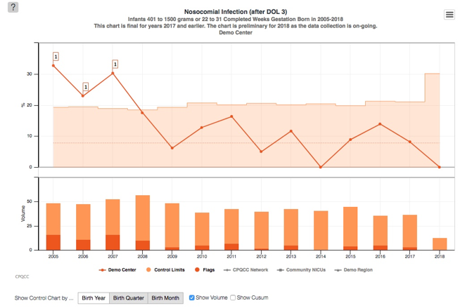
In 2020, CPQCC added a new featuring giving users the ability to annotate their control charts to reflect when quality improvement interventions occurred and define the baseline period, intervention period, and sustainability (maintenance) period. The video below explains this new feature in more detail.
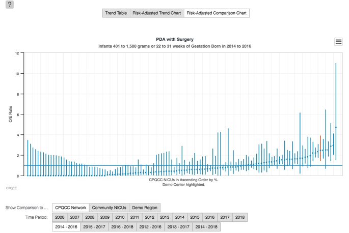
Risk-Adjusted Charts
Risk-adjusted charts allow NICUs to compare their performance on individual metrics against similar NICUs (e.g. community NICUs), a region, or the state as a whole.
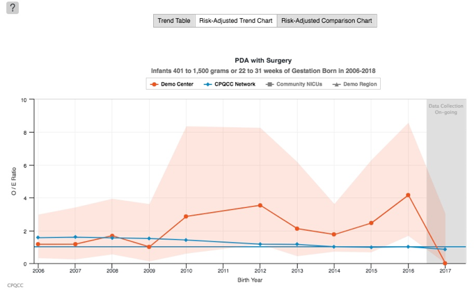
Risk-adjusted information is available in the form of trend charts (above) and comparison charts (below). Comparison charts display one line for each NICU in the chosen comparison group, with the user’s NICU highlighted in red. The lines represent the range of data obtained from each NICU. A short line indicates low variability, and a long line indicates that there is a wide range of variability in the data from that NICU.
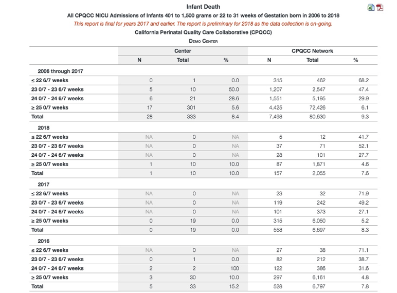
Detail Tables
Detail Tables allow NICUs to drill down on specific outcomes by gestational age or birth weight for each year of data entry. This allows a NICU to compare their outcomes, by quantity and by percentile, to the CPQCC network as a whole. For example, detail tables could answer the question, “what percent of my NICU’s infants born at 24 weeks 0 days to 24 weeks 6 days died in a particular year and was that percentage above or below the CPQCC network percentage as a whole?”.
Need more information on how to use our reports?
The home page of the NICU Reports site features in-depth explanations of the various components of the site as well as the many different report and chart options available to members at the NICU and regional level, some of which are described above. You can also download this information in a PDF from the NICU Reports site. Additionally, we offer one-on-one sessions to review your center’s reports with one of our analysts. To schedule a one-on-one session email info@cpqcc.org.
NICU Reports "How to" Videos
Watch the full video series or view highlighted videos under the report descriptions to the right.
Did you find our videos helpful? Complete this 1 minute or less survey to give us your feedback.